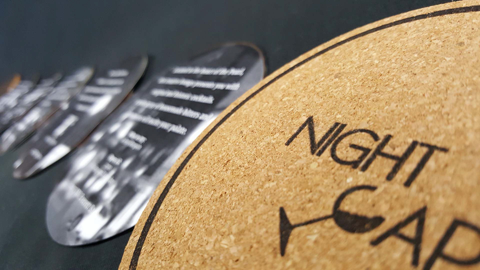
Night Cap
GOAL:
Design a zine
Night Cap is a small zine designed for hotel lobbies. This zine showcases popular local places that offer late night refreshment. Magazines are often read once and put away or thrown out. I wanted to create a zine that had a purpose and could be used repeatedly.
Front cover
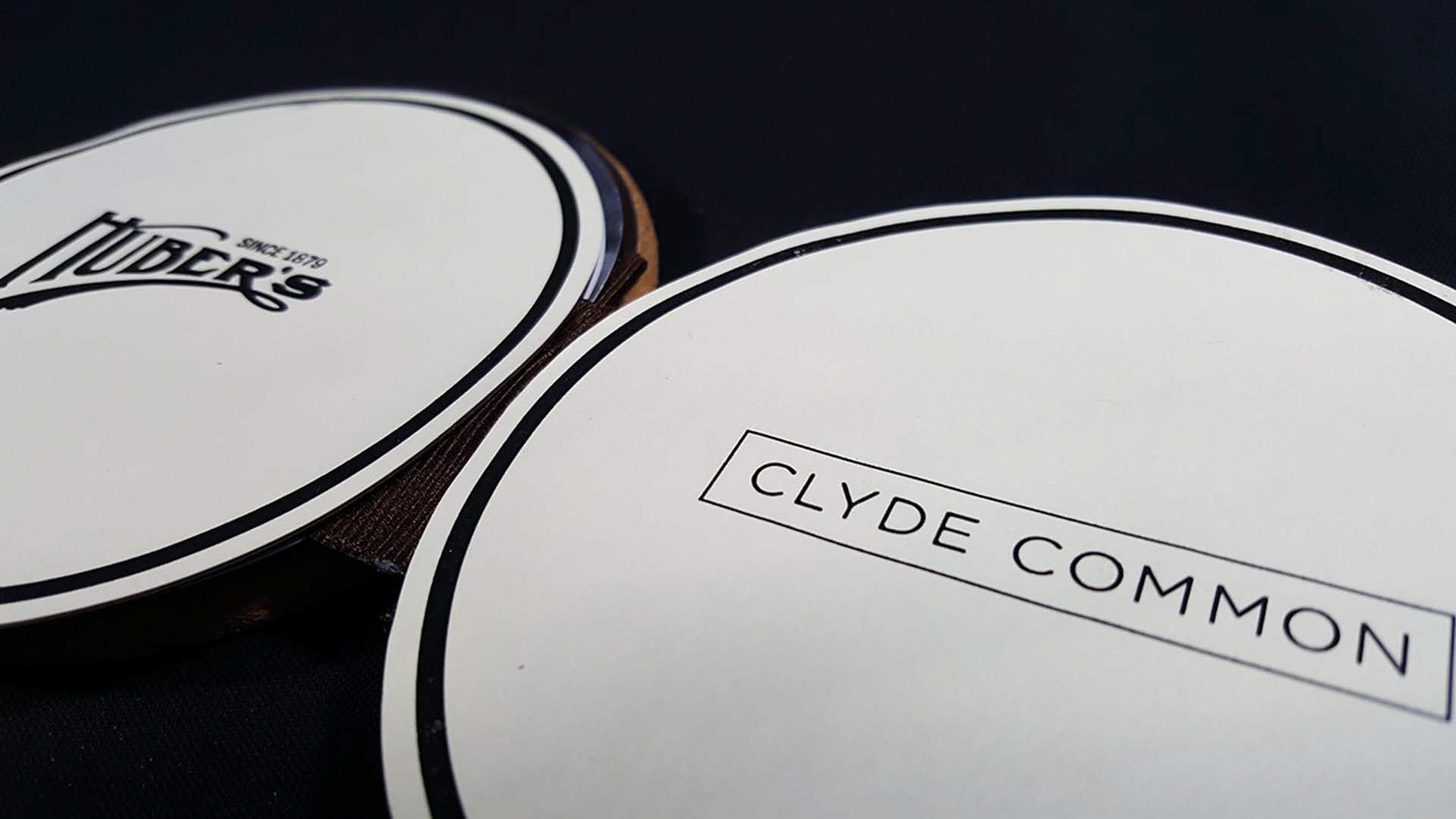
I started my process by looking for inspiration online. After coming across a few coaster designs, I realized that every bar and restaurant has unique coasters, coasters that tie into their branding. I thought these could be compiled into a collection as a zine. Based on closing time and online reviews, I selected five bars that were open late.
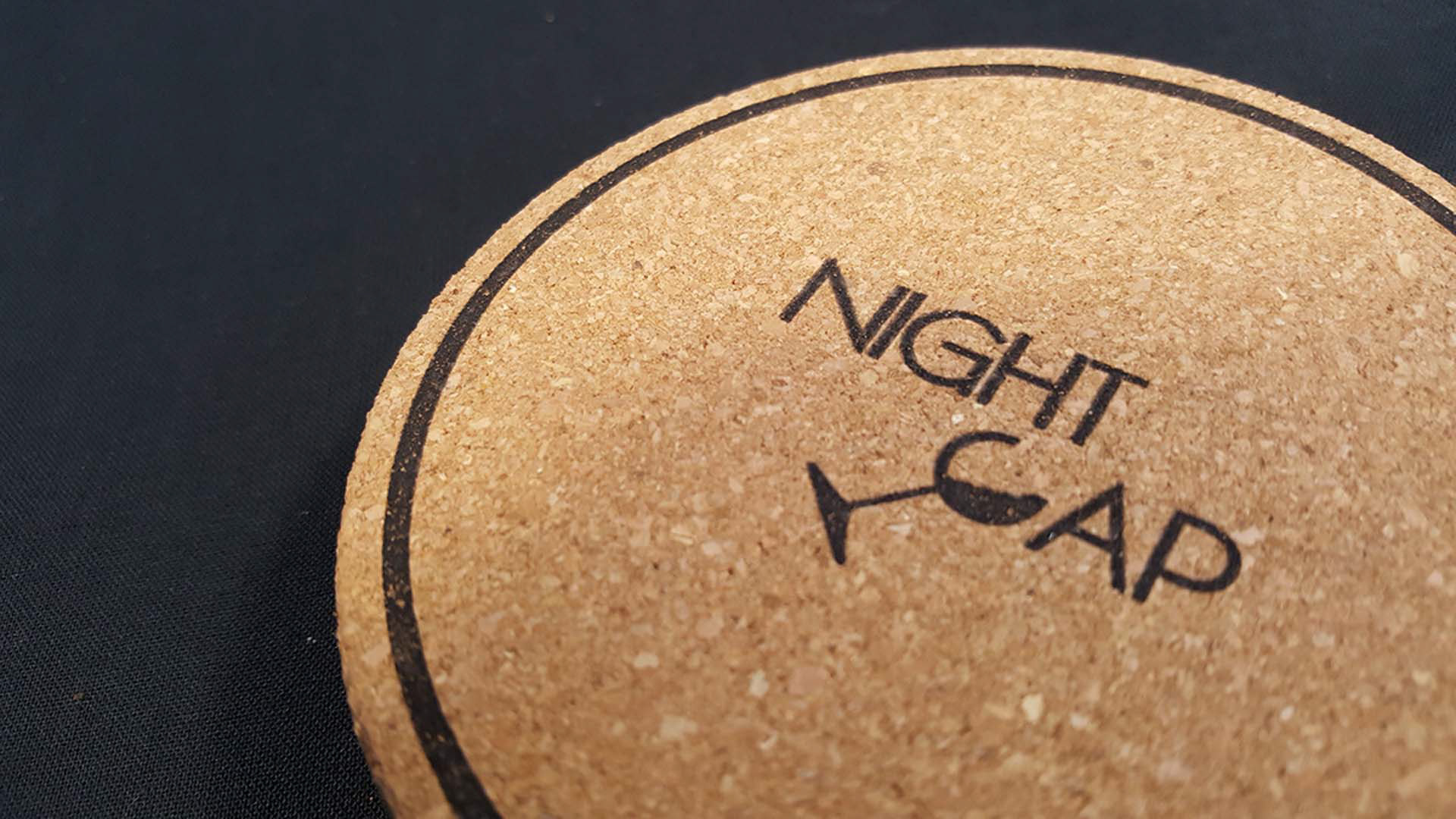
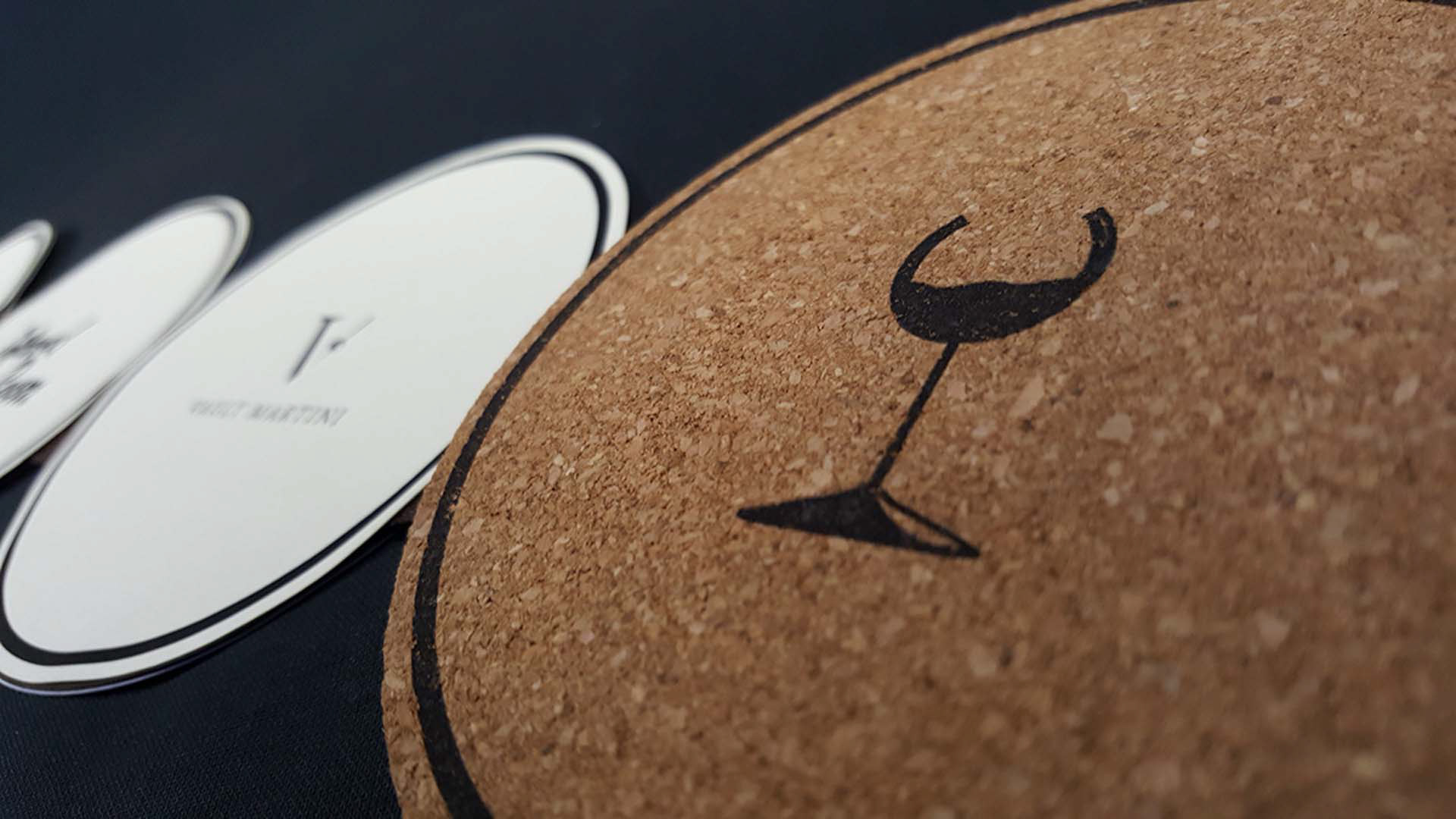
I compiled the logos of each business for the front of the coasters. I kept it simple and clean. I wanted the logo to be easily recognizable and the overall aesthetic of the zine to be classy and higher end, such as a four or five star hotel.

First page
Inside pages
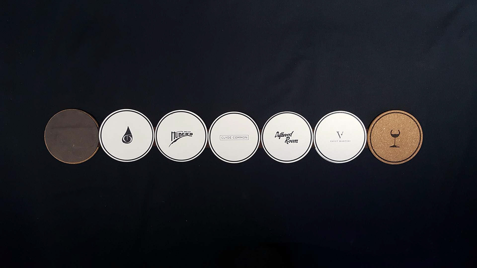
All pages fully extended (logo side)
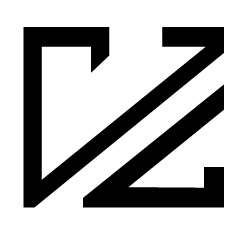
Originally, I had kept the Night Cap wordmark as just typeset text. While doing research on each business, I saw the 'C' resembled the curvature of a wine glass. After creating the wine glass 'C', I rotated the mark for readability.
Back cover
This zine is designed for tourists and because of that I wanted it to have a Portland touch. As a background for the back of the coasters I photographed locations that were unique to downtown Portland such as Pioneer square. I treated the photos with a black and white filter to accompany the night time aesthetic. Over the background I included descriptions of each place's atmosphere, suggested drinks, and location.
Front cover and info side
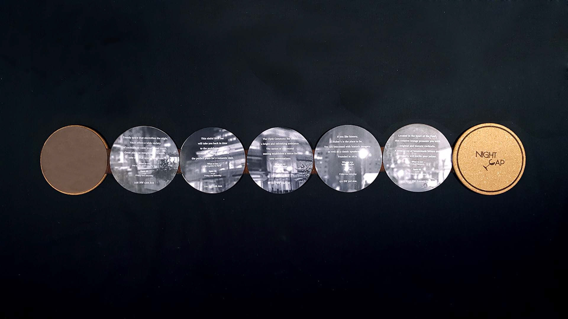
All pages fully extended (info side)