
REBRAND: FL STUDIO
GOAL:
Rebrand an existing company, product, or service.
FL Studio 12, also known as Fruity Loops, represents more than 18 years of innovative development. The software provides everything you need in one package to compose, arrange, record, edit, mix and master professional quality music.
I have used FL Studio for many years. The tools available in the software have been consistently updated with each new version. However, the software's branding has remained the same throughout these iterations. I wanted to update the branding to reflect the modernization of the software.
Original Logo
The original logo was futuristic for its time, but now feels dated. The coloring has too much detail and the shape lacks edge and simplicity.
Original Logo
SKETCHES
FL Studio is predominantly used with electronic music and is often associated with a futuristic aesthetic--I was thinking of artists like Daft Punk and EDM concerts that use lasers and LEDs in their performances.
I started by looking at videos of EDM concerts and images of studio setups. I took inspiration for the sketches from musical tools and components such as equalizers, synthesizers, and sound waves. I played with various versions of marks using both positive and negative space.
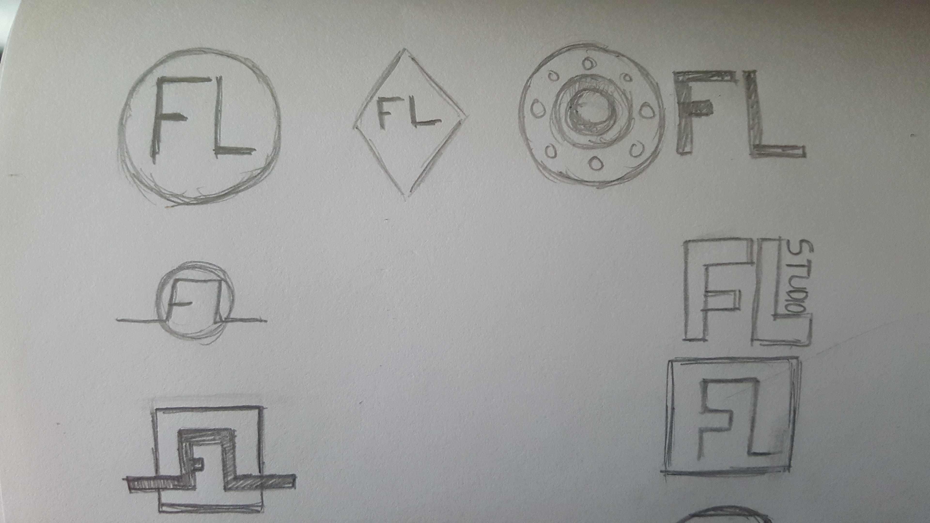
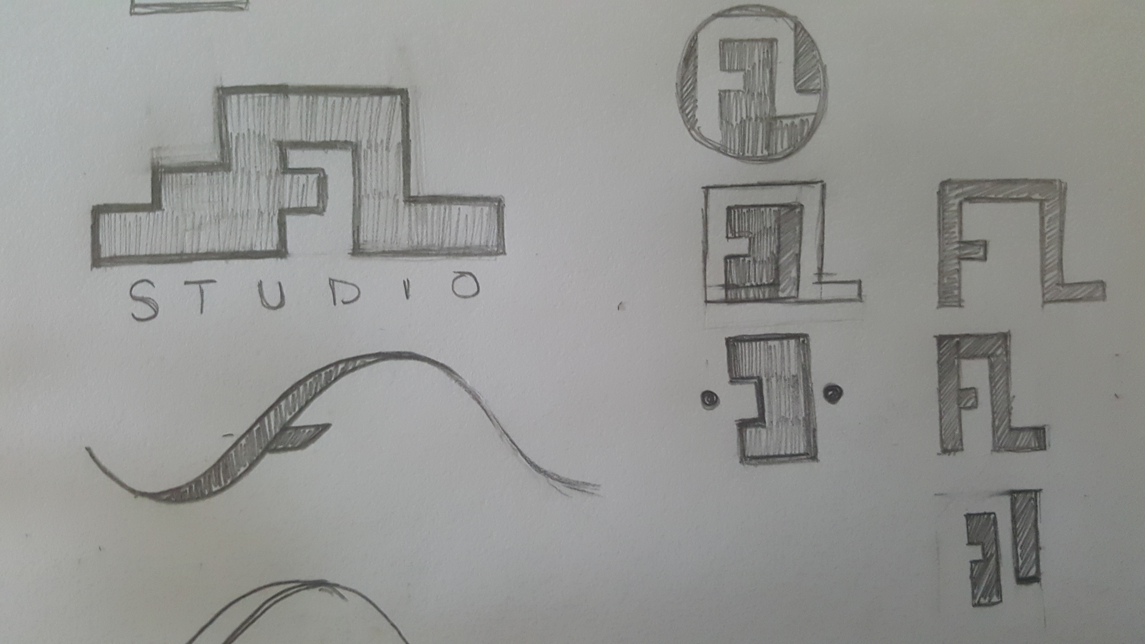

Hand sketches after looking at inspiration
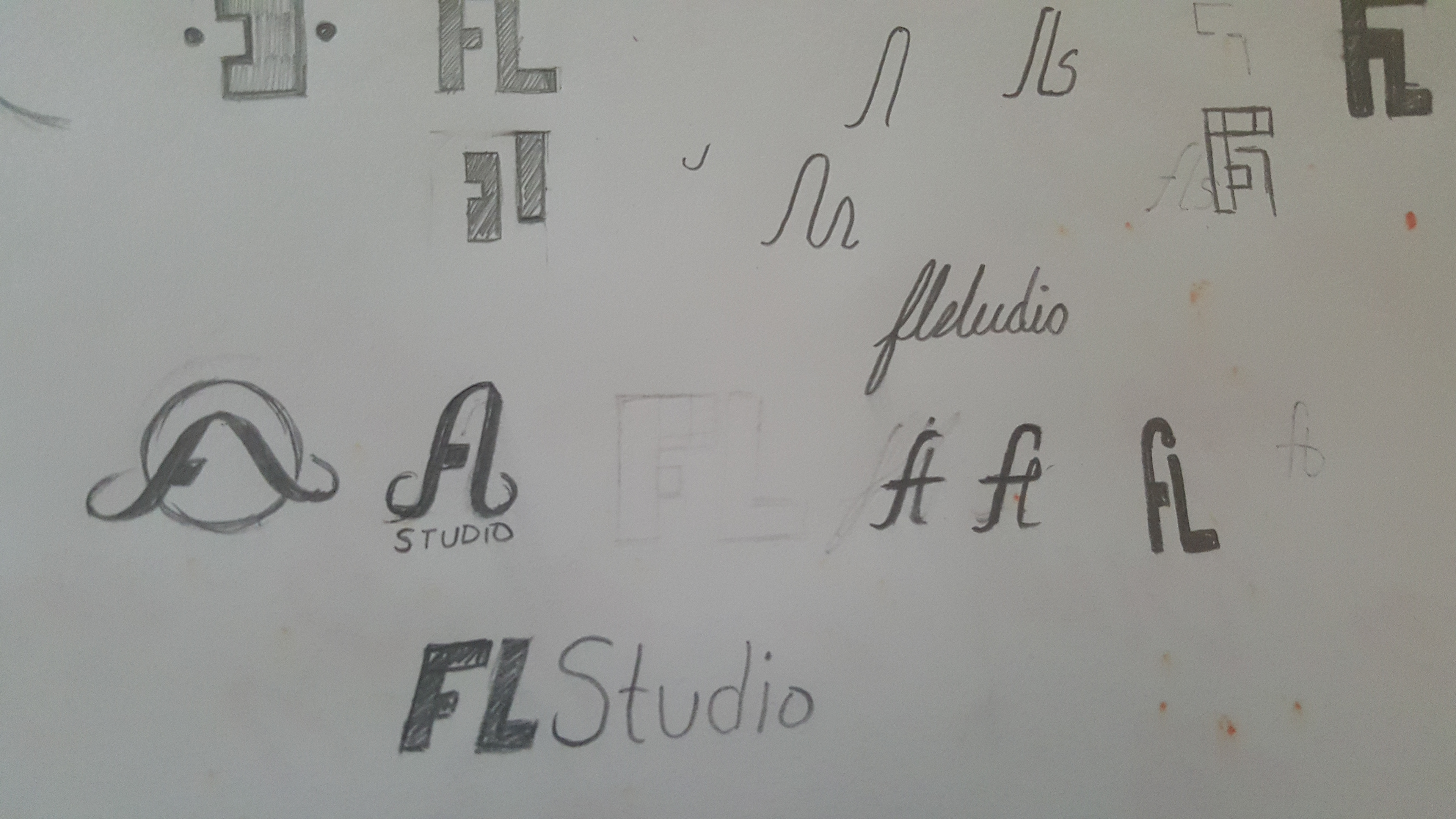
DIGITAL COMPS
After laying down my sketches, I picked a few and started making some digital comps. A couple had potential, but I felt that the waveform shape was fitting. Expanding on the waveform shape, I made as many variations as I could.
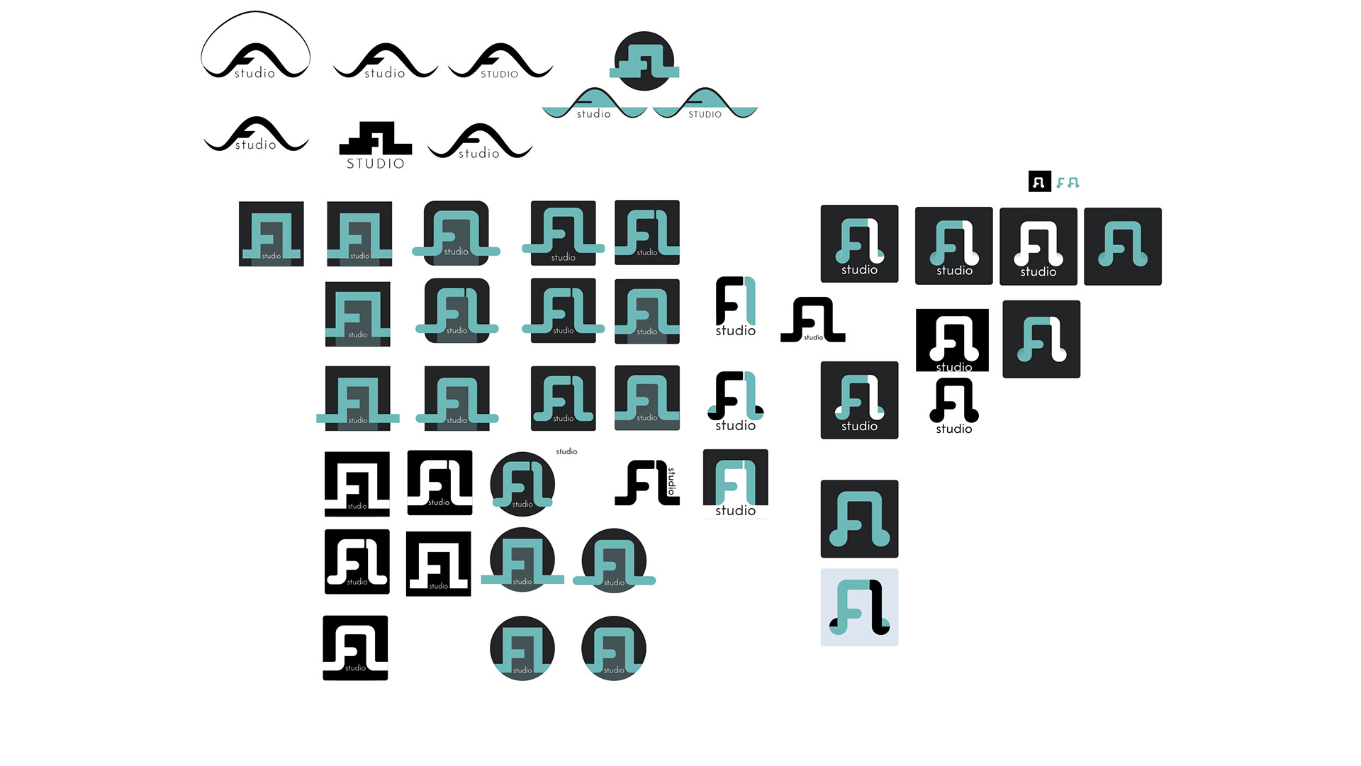
Digital comps and variations
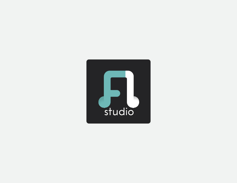
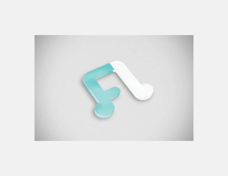
Finished Logo
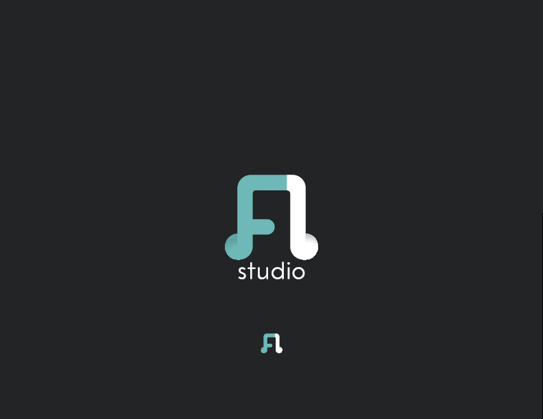
The waveform evolved into a musical note. This was the final mark that I was set on. I found that the FL was easily recognizable. I wanted to create a little visual separation from the FL and the music note so I added a slight shadow, which has the added benefit of creating some depth and slightly lifts the mark off the screen.
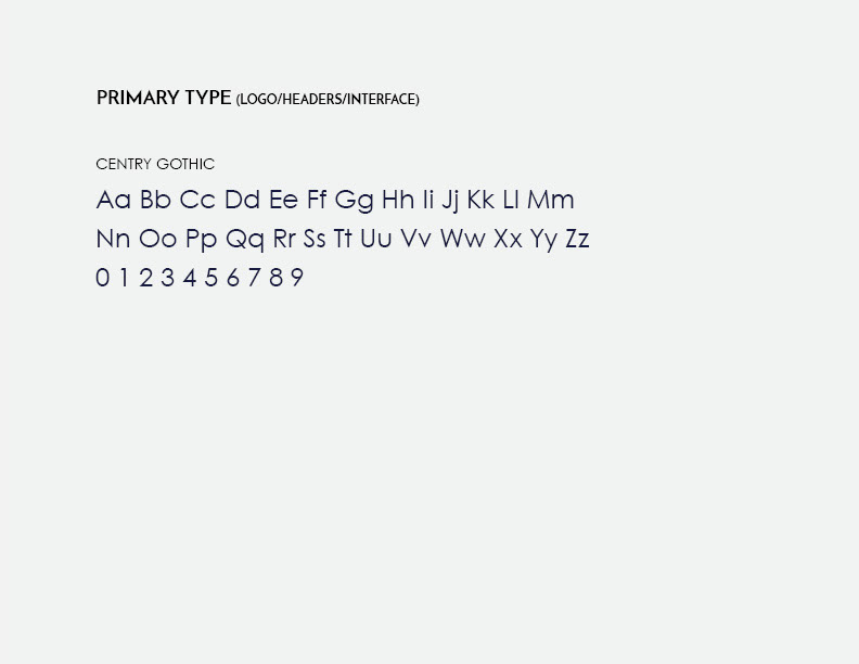
After the mark was finished, I added "studio." I used Century Gothic for the typeface because the geometric nature of the typeface matched the roundness of the FL mark. I decided to keep this all lowercase in order to not take too much light from the mark and for a better lockup with the curvature of the music note.
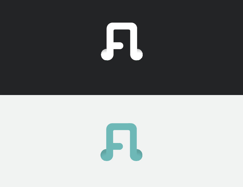
Final lockup on the left. Solid color variations on the right
Icon
Icons
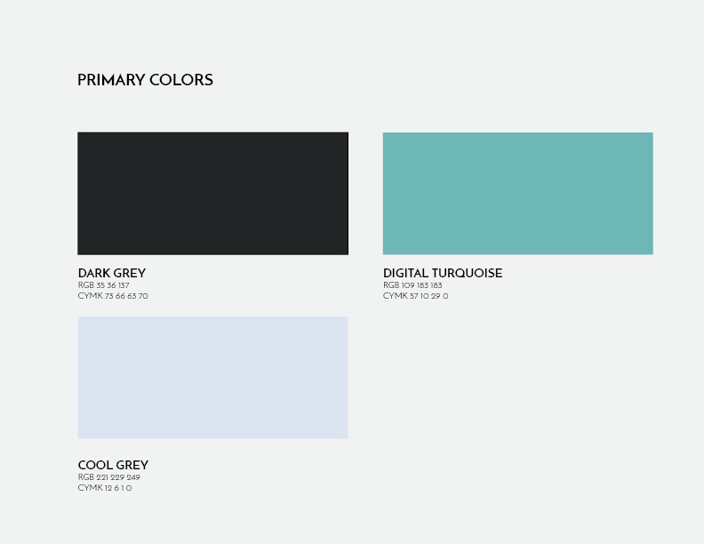
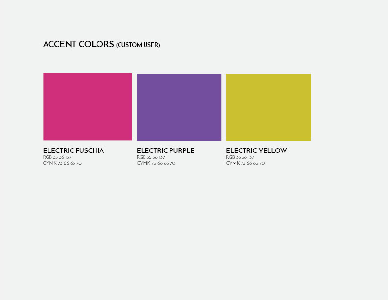
Branding: Colors and Type
I kept the primary colors muted. I believe that this helps to create a more immersive atmosphere in the interface. For the accenting colors I used bright saturated colors that I felt were reminiscent of electricity and lasers. The colors work together to create a digital wonderland.
Branding presentation
Application
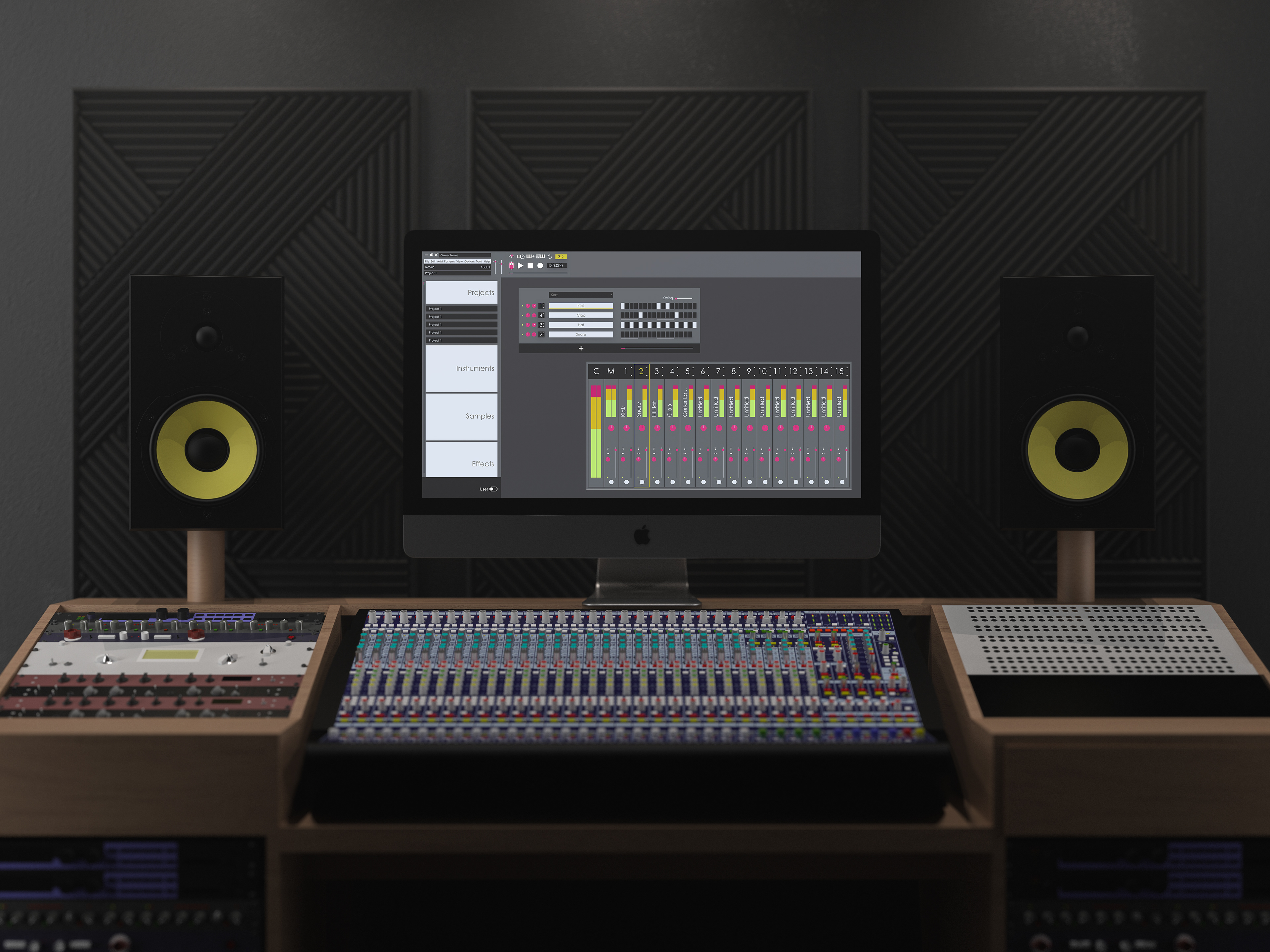
Application mockup
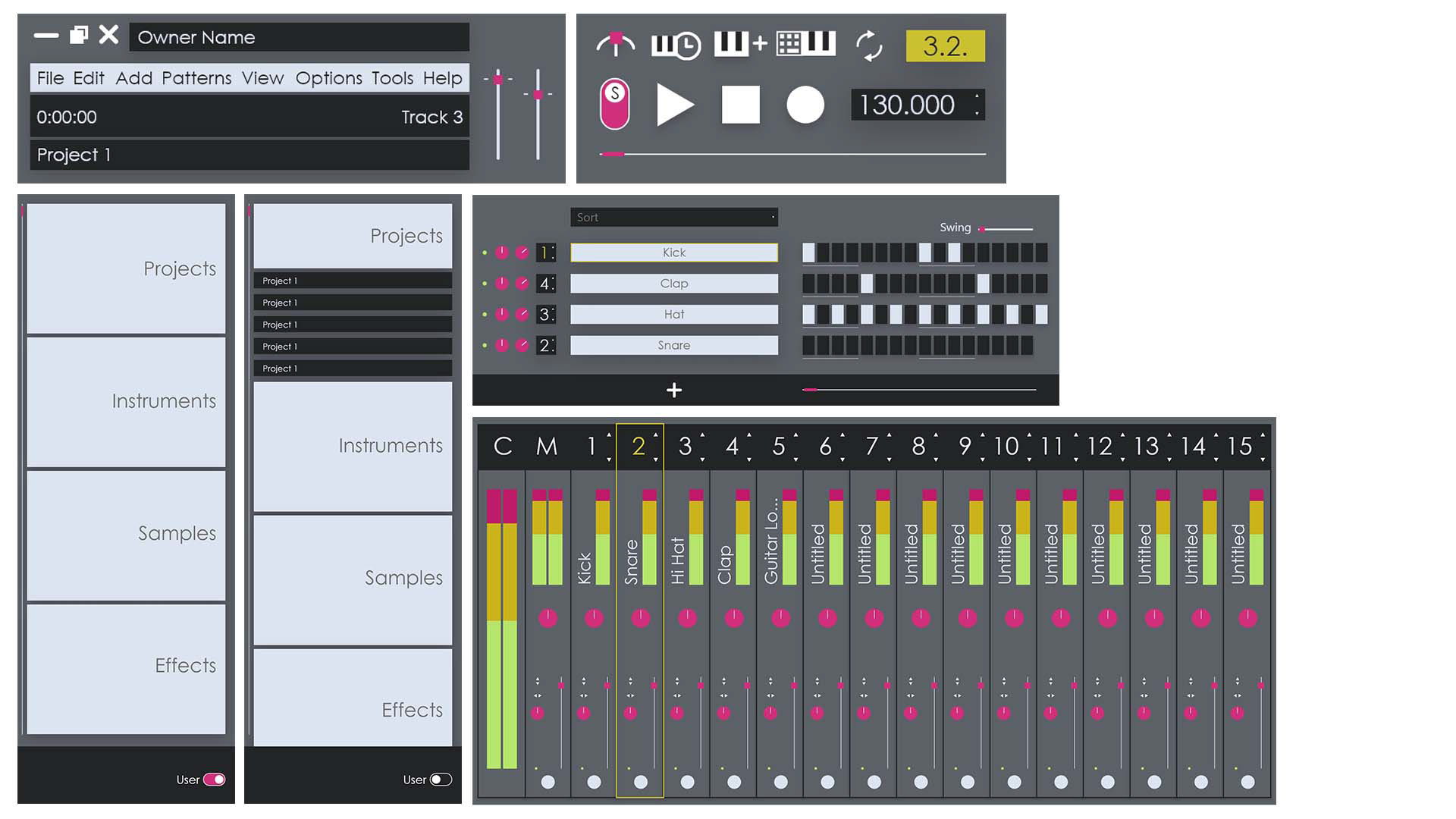
Application elements
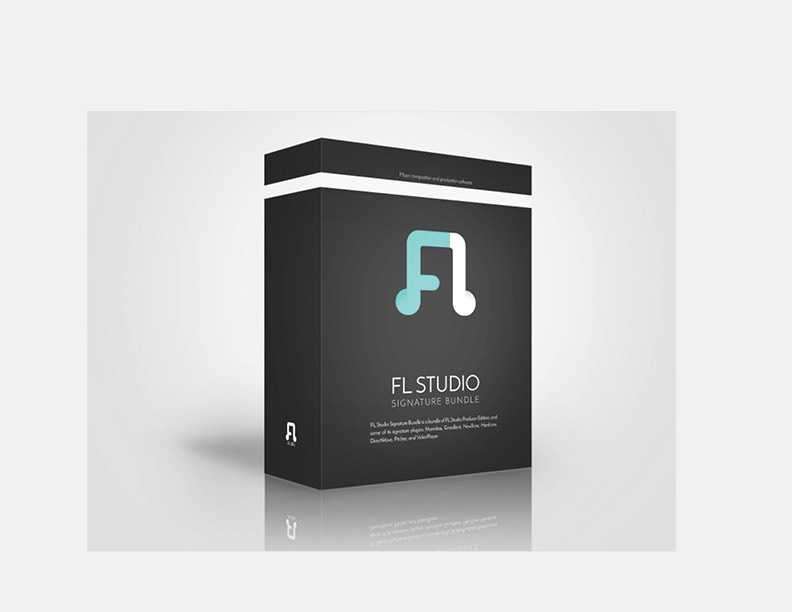
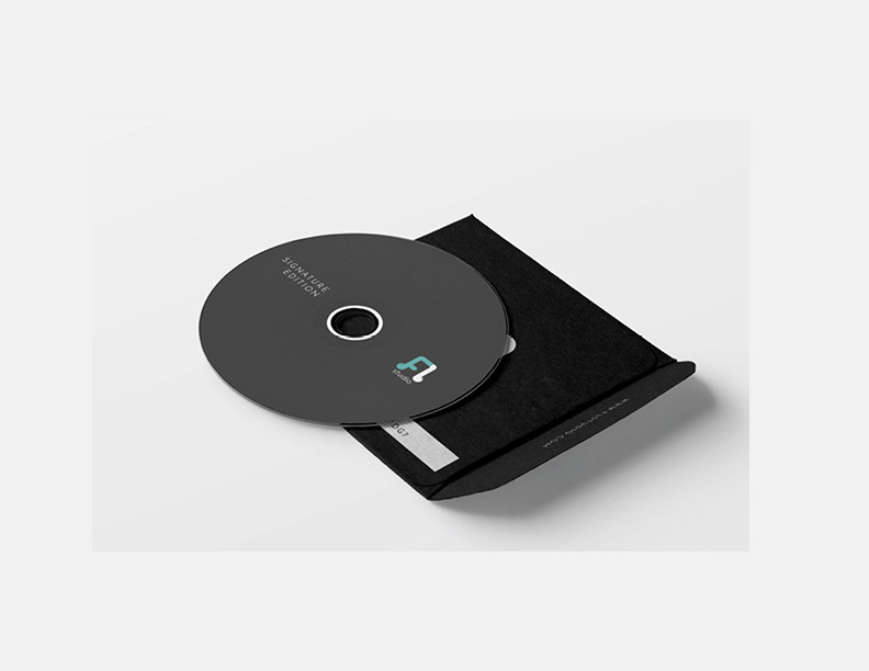
Product box, CD, and laptop stickers